Every brand has its own *personality*, how your brand is perceived depends on the colours used when marketing your business or product. One little known fact is that colours and colour choices can have a big impact on how your product or service is perceived. You not only want to convey a message with your banner, you also want to build an experience or relationship with your clients and customers.
As we head into 2019 it’s important to look at colour options, how they are best used, and how you can make your banner the best in a sea of banners all vying for customers attention.
It’s important that you *translate* your product or service into your banners and ad campaigns in general. There is a science to the way your brands colours seem to engage with clients and customers, their reactions, actions and if it starts a conversation. Colours are important, they have to have context, you’ve chosen the right colours when it emphasis’s your message, not fights against it.
Let’s have a look at some colour options for 2019 that can help bring your advertising banner closer to achieving your goals for the year.
- Yellow: while yellow can be associated with energy, sunshine, optimism, gold and treasures using too much yellow can be risky as it can become irritating to the eye, so it’s best you use it in moderation. Yellow is a rather powerful colour, so you should try balancing it out with some blue or black.
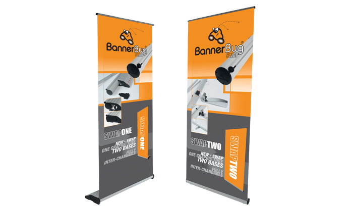
- Orange: it stands out in a crowd and invites your audience to be friendly, enthusiastic, creative, it brings out the child in people and inspires them to feel young again. Depending on your message orange can be used on its own as a background colour to grab people’s attention as long as it’s balanced out with black, grey or white. Orange is great for the brand that is aiming at a younger audience and wants to stand out in a crowd.
- Red: Passion, love, fire, speed is all associated with red, it’s a colour that evokes quite powerful sentiments. It’s a challenging colour to use because it’s not just about the colour the context is also very important. Red is an experience, and this has to be backed up by both your product and the banners you create for it. Use reds for the brand that wants to make your blood pump, perfect for the food, entertainment and retail industries.
- Purple: a colour associated with royalty, luxury and wisdom, purple is a colour that inspires magic, creativity and ambition – *anything is possible*. Purple is a great colour for a business that wants to inspire credibility and trust.
- Pink: depending on the shade chosen, pink is a caring and impacting colour. Vibrant pinks have a youthful energy, they really stand out. Dusty pink and pale pink shades have a girly message and are great for a business targeting women or girls. Pale pink is a perfect choice for businesses targeting teenage girls, while a strong pink is aimed at slightly older women.
- Brown: an earthy colour that evokes feelings of tradition and relaxation, while the use of brown can be risky – some may see it more as the colour of dirt, it can portray your business as one that is well established and has been around for a long time. Brown is honest, simple and earthy, classic and genuine, and is a great colour for those in the fashion and retail industry.
- Green: an emotional colour that signifies nature, prosperity, abundance rebirth and growth. It’s a peaceful and calm colour and deeper shades of green can stand for luxury and wealth and is a perfect colour choice for heath and environment related businesses.
- Blue: it’s a difficult colour to put into one box, it gives a sense of tranquillity, strength and assurance. Light blue shades are peaceful and calm, compassionate and caring. Blue is a great colour for the banking, IT, and technology companies who want to inspire trust and dependability.
- Black: while technically black isn’t a colour a lot of brands use it in their branding, black combined with another colour or a simple plain black logo. It can be used alone because it’s powerful, bold and confident, one of the most readable combinations is black and white, and one of the most powerful is black and yellow. Companies who are offering a strong sense of power or masculinity use black, it’s popular in the newspaper, car and technology industries.


